Top 8 graphic design trend predictions for 2018
This year, if you want to stand out from your competitors, you’re going to have to take risks. Whether that be in your personal life or in your business, more and more things are competing for the audience’s attention. So if you want to stay on top of your game, you’ll need a few tips from us.
This year’s graphic design trends are all about maximum exposure. They incorporate colour, shapes, size and details — a complete opposite to last year’s trends of minimalism and negative space.
So if you want to stand out, you’ve got to take the risks. Here’s how our designers can help you do that with their 2018 predictions for graphic design trends:
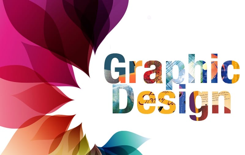
1. Bold fonts
Last year, it was all about minimalism and hand drawn graphics. This year we switch to the opposite and embrace bold and dominate fonts. Bold fonts allow your products to leap up at the audience and capture their attention.
The Little Alchemist uses different bold fonts to create an eye-catching design
As opposed to minimalism, bold fonts drawn the eye to a particular component
2. One colour
It may sound simple, but it is very effective. Using the same background colour as the product makes the product stand out, as its 3D effect gives it volume. Brands can also exemplify its iconic colours, such as Vegemite and its association with yellow.
Not everyone likes Vegemite, but colour is universally pleasing
3. Multi-colour pops
As you can tell, colour will be a running theme in 2018. Last year was all about the crisp negative white. This year we see brands branching out into multiple vibrant colours schemes instead of just one, to help them stand out amongst a sea of competition.
Tim Tam got the memo, mixing up their traditional brown colour scheme with pops of vibrance
There’s a new sheriff in town, and his name is colour
4. Custom illustration design
Stock imagery is a thing of the past, with brands in 2018 predicted to use custom illustration more. Custom illustration adds personality to a brand or product through visual language.
T2 gets funky with vibrant and eye-catching custom illustrations on their product boxes
5. Isometric design
In 2018 graphic design is rebelling against its boring flat design parents, and running away to be with its funky new boyfriend, isometric design. The techy explanation behind isometric design is that it is a way to visually represent three-dimensional objects in two dimensions. If that makes no sense, it’s basically a way to add 3D-looking, interesting imagery to your design.
Ben and Jerry’s knows exactly what Isometric Design is (because heck, I still don’t)
6. Maximalism
Because, more is more. Like we said, colour is in this season. You know those prints that are so garish they appear ugly, but after deep consideration you come to think of them as quite beautiful? Fashion has been doing it for years, now graphic designers are taking note. Colour and detail will be maximised and eccentricity will replace flat tones.
Frank Body: extravagance is the new black
7. Retro modern
Moving away from ultra flat designs, geometric throwbacks to the past decades will reappear this year. We know by now that previous decades fashions always come back into popularity (jelly sandals, anyone?). 2018 will see retro become modern again, with modern sleek lines meeting throwback colours and patterns from the 80s and 90s.
Beauty brand Mecca takes advantage of modern colours meeting retro geometric patterns
8. Detailed vintage
This year retro has morphed into vintage and it’s not going anywhere in 2018. Vintage design will continue to increase in popularity, with highly detailed vintage taking the new crown. Vintage offers classic design aesthetics giving a hand crafted, wholesome feeling.
Highly detailed vintage is popular in the food and beverage design industry, providing a look of sophistication


Vivo Packaging Pty Ltd
Aussie Warehouse:
4 Tasman Ct, Keysborough VIC 3173, Australia
Monday – Friday: 9.30am – 5.30pm
Visitors By Appointment Only
Copyright 2024 © VIVO PACKAGING. ALL RIGHTS RESERVED